Product marketing site
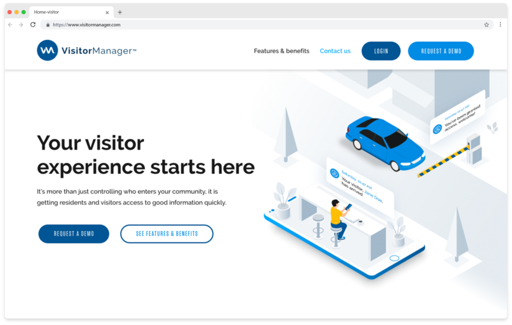
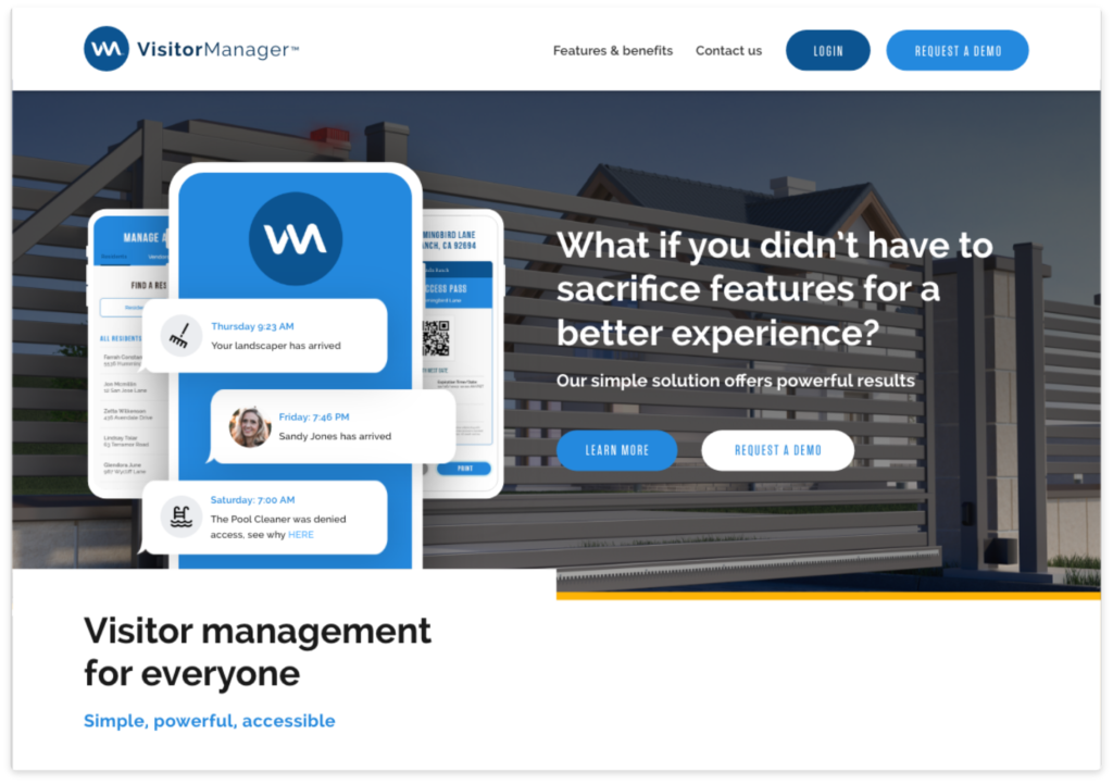
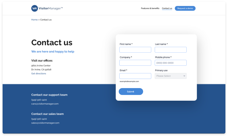
VisitorManager came to us with a need for a new product marketing website. We had previously built them a mobile app and they were now going to market with it and wanted an engaging product site to represent it.
The problem
The client identified four unique users of this software, with only two of those users likely to influence a purchase decision. It’s a new product that doesn’t have much market coverage and operates differently than its competitors.
VisitorManager wanted a clean tech forward site that sells their unique value vs competitors by highlighting why their product is unique and the problems it solves for all four types of end users.


What I did
I led design on this project from start to finish. In addition to site design, I updated their logotype to feel fresher as well as creating a top of page illustration. I sourced the photography and built the site once the design was signed off on in WordPress.
Challenges
There were several challenges designing this site. The first was making it clear how the product works and the advantages it has vs competitors.
A second challenge was that the target customers and app users were four very different groups with different needs. Illustrating the different uses also presented a potential challenge as different user roles see different sides of the actual app.
And lastly while the designers on my team who’d design the mobile app had created typography we could use there was only minimal visual style to draw upon in creating the site. The client wanted a clean modern “techy” look that felt very cutting edge. Most importantly, VM stakeholders want it to serve as an effective sales and customer information portal.

Results
The client reports that the site exceeded their expectations and goals. They appreciated we kept the project on track with steady project management and speedy revisions. We had 3 rounds of design revisions and then built the site. Design lasted 3 weeks and I built the actual site in 4 weeks including changes based on their feedback as it went live.
They report they’ve had good response from their customers and came back to have us design another site for one of their other products based on the success of this site.
Final site live here: www.visitormanager.com

Next steps
If there was time and budget I would’ve liked to further develop the client provided copy as well as test the site with representative users from each of the 4 categories they identified.
Analysis of analytics now that it’s live would help provide insight into how the site is being used, I would be especially interested to see which calls to action were most effective. There has also been discussion of further refining and expanding the app based on the work I did on the site.
I proposed linking to the web portal as an added way for customers to get to their dashboard but at launch that functionality had not been set-up.
