As SHURE’s Designer conference room layout software has grown to offer more monitoring options, product managers and UX researchers have received feedback that there is not a strong enough notification system for hardware errors and offline devices.
The problem
The existing software has error notifications for some errors and in some views, and they are not applied consistently. Many device connection errors were not meaningfully transmitted to users or where they were very little information was provided on what had gone wrong or what a user could do to fix the issue.
There was also research indicating that users find the existing error framework especially in the case of firmware overly granular and at times confusing. There were 3 indicators for firmware state. Color coding is used for positive hardware connection and positive port connection but no notification is given for disconnected ports or devices. Research also found that existing error notifications didn’t make enough distinction between large errors and minor errors.
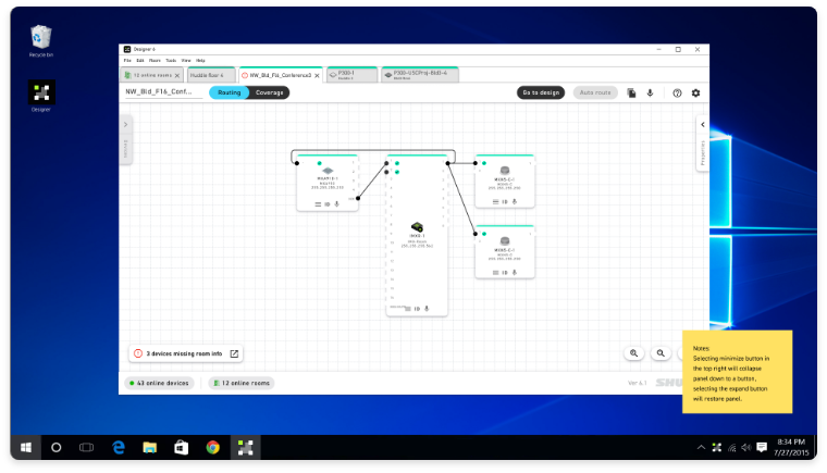
The errors needed to be consistently displayed across three very different screen types: online rooms, routing view, and device coverage view while creating a more distinct ranking of errors so users are given the appropriate level of warning for audio not working and less obtrusive notifications for errors that may be user driven or are not “show-stoppers.”
Solution
A program wide system of error notifications, including offline hardware, hardware with bad firmware, and devices that had not finished being deployed.
My goal was to create a “breadcrumb” system of error notifications that helped a user find errors as they moved through the various screens so they could locate and troubleshoot error devices.
I helped write error notification copy and strongly pressed the need with technical stakeholders that it was worth the extra development effort to create error resolution paths for each error type rather than just notify users of problems.
The challenge
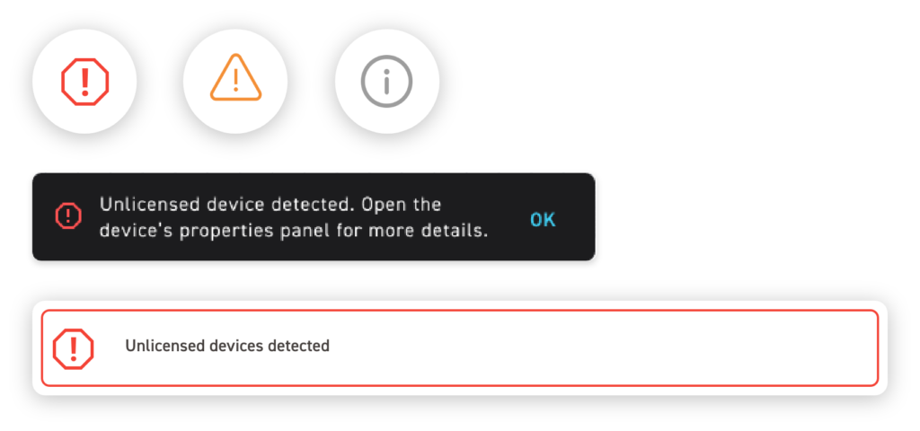
Examples of existing error icons and banner types with final copy
Error categorization
I began by working with the development team to inventory all known possible errors. I then subdivided these errors into broad categories. Initially I had 3 categories plus firmware. After beginning to wireframe through possible scenarios and reviewing with internal users and other designers it became clear that there was really only a need for two error icons.
Conversation with development and engineering revealed that most errors resulted in a device not passing audio-if this was the case there was never a scenario where a mild “yellow” warning was appropriate. All errors that kept an audio room from working would show up as a red stop sign-their established icon for big problems.
Finding the right level of warning
I had proposed lumping bad firmware into the red error category as well to further reduce the number of errors but review of user feedback showed that their primary customer group of tech savvy customers preferred this level of granularity of device vs firmware malfunction. Discussions with engineering also revealed that bad firmware did not always prevent audio passing. I suggested that we get rid of the green and yellow firmware notifications, allowing users to assume that a connected device was good unless otherwise indicated.
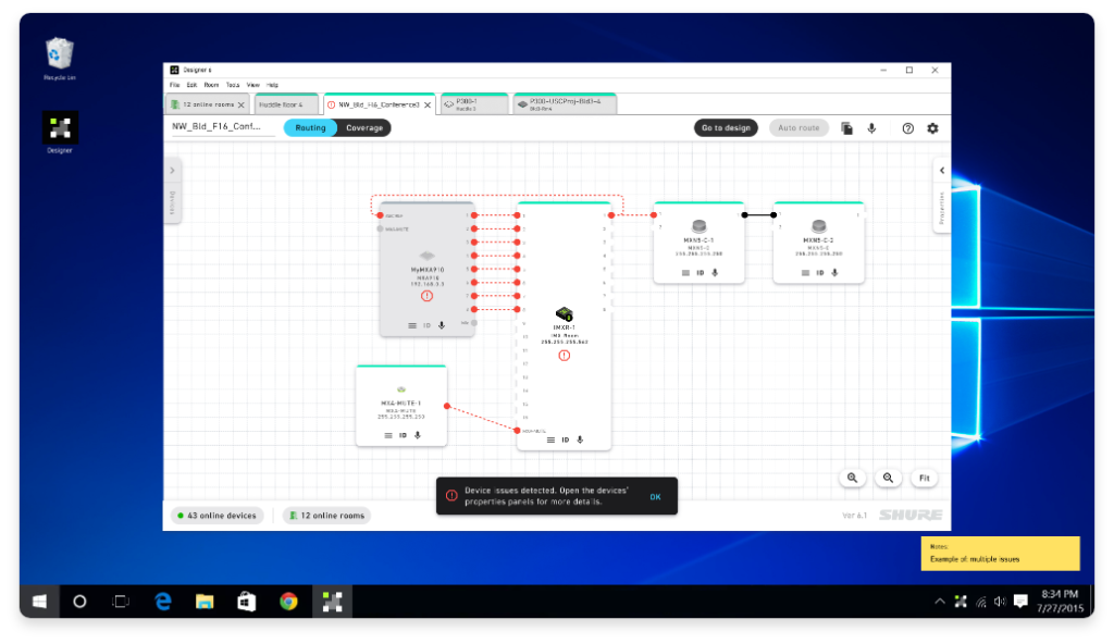
Currently when devices went offline they would turn grey. I proposed adding an error icon to these devices as a gray block was not necessarily enough of a warning that device might not be passing audio especially in larger rooms with many devices. As I continued to iterate through this design, it became apparent that we needed to show not only that a device was offline or disconnected but how that effected its potential audio routes. Starting at the ports which were shown as red, with a red dotted line where the route was (if it’s location was retained by the system).
Example of device blocks in disconnected and connected state
Notification system
I helped created a more intuitive and coherent error notification system than previously existed. In many cases the current version of Designer could have a completely non-functional room with little to no user notification that there were significant device problems.
I created a new concept of an offline device notification panel as well as well as a more durable and clear system of error notification. In tandem with this project I closely with the lead designer for the project with a similar process she was working on of creating a better system of displaying routing errors so there was a coherent system of error notification across the software.
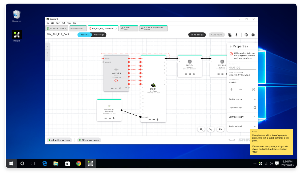
Mockup showing what an offline device looks like in a typical room
Offline device depictions
Making this software more approachable to beginner users while not alienating tech savvy core users was important. This design shows the device’s property panel gives hints as to what could cause an offline state as well as basic troubleshooting tips as well as a link to the manual to learn more in-depth on how to troubleshoot.
Examples above left to right:
1) A devices that have gone offline but the system has retained device information 2) The same device with its property panel open to display resolution suggestions 3) Example of a screen where several devices that have gone offline and have no information to place them
Expanding the system
A room with a un-deployed “virtual” device in it. This is typically a user driven action but it was important to notify them as they may have forgotten and since this device has not finished setup and it won’t function.
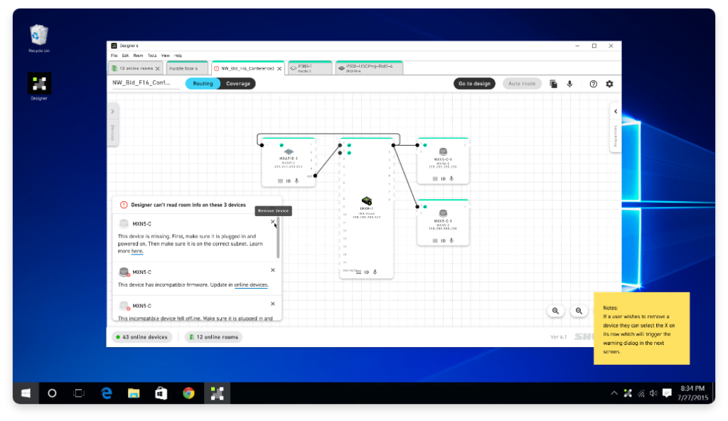
More exploration showed that one device going offline could potentially affect audio routing for several, so a later iteration showed routing errors as a broken red line.
Accommodating edge cases
It was discovered from Beta users that there was an edge case where a power over ethernet device could be passing audio but not fully functional. This was the first real case that justified the yellow warning triangle-thanks to having a system in place this was easy to slot in and will be scalable for future issues.
Next steps
Moving forward on this project I would have liked to further refine color usage and overall overall system used for connection, and firmware status. There were team discussions about adding room monitoring to the home screen. With more time on further versions I would have liked to have found and advocated for ways to create stronger resolution paths.
I worked with the lead designer on this project to create a user testing plan and objectives before my contract ended. Specifically I wanted to test how quickly users could understand what was happening, and what happened when they tried to resolve issues.